Calivirgin Olive Oil Packaging
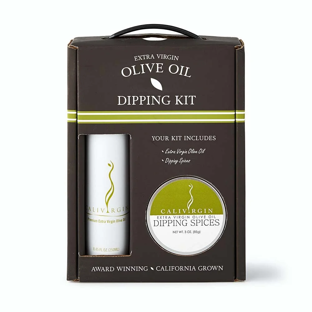
Calivirgin Olive Oil has long been a name I’m familiar with. For anyone that lives in the Central Valley and drives I-5, you’ve almost certainly seen their farms (and beautiful new barn). When approached to create packaging for their dipping kit, I was met with a few obstacles—job is only two colors, and must be printed flexo. Wanting to get in enough detail that this didn’t just read like a stamp, I had to get a little creative with the printing process. Ultimately, those at Calivirgin, as well as Williams-Sonoma, were happy with the results.

Limited to just two colors for printing, I decided to use a black substrate to bring in a third. Then, overprinting with an opaque white, I had no challenges printing or viewing anything on top of the black. Using the windows we cut into the face of the container, the actual packages for the oil and dipping spices were able to display—bringing in more of the white and greens that were used in the box design, allowing some room to breathe around the dark black cardboard.